Help Students Get the Most Out of Infographics
 By Sunday Cummins
Do your students love a good infographic? Kids in the middle grades are frequently drawn to infographics because of their visual appeal and because information is presented in small bites. An infographic may be just one graphic, like a diagram, chart, or map, or it may be a compilation of graphics like the NASA infographic below.
While infographics can be engaging, our students do not always access the content in a way that leads to deeper understanding. What follows are four suggestions for helping students create pathways for learning from this type of source.
1. Examine key features to make predictions.
Before students jump into “reading” the information in an infographic, encourage them to notice a few of the key features as a way to make predictions about what they will be learning from this source.
In the NASA infographic above, when I read the title “A Whole New Definition to the Word ‘Suit’” I thought about what I already know about space suits and began to wonder what else there was to know.
Then I noticed the heading underneath the title, “A space suit can have up to 16 layers,” and perused the image of the space suit with labels for different parts of the suit. Some of the parts like “display control module” sounded unfamiliar. I already knew these suits were complicated, but this information made me think “Whoa!” and want to read more.
Thoughts like these can help a student begin to make meaning from the material and serve as a purpose for reading — asking, “What am I learning about space suits that is new and innovative?” and “What are all of the layers?”
2. Notice the structure of the infographic and use it as a guide.
Infographics that are a compilation of graphics can have a structure or a blend of structures similar to those of traditional texts (e.g., descriptive, sequence/chronological, comparison, causal, problem-solution).
The structure of the NASA infographic above is descriptive. The heading “16 layers” and the labels “display control module,” “gloves” and “helmet” are clues that the author will be describing or teaching the reader about the different parts of the suit.
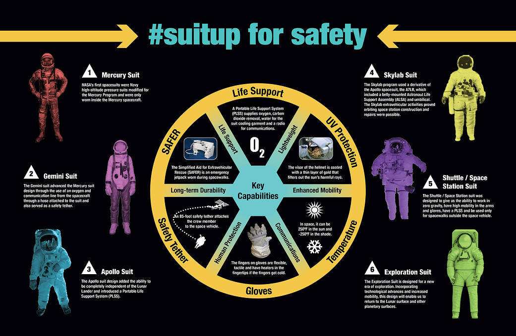
If you want to see an infographic with a different structure, check out the NASA infographic “#suitup for safety.” The developer of this graphic uses a blend of structures. The information about how the suits have changed over time is written in a chronological and comparison structure, surrounding a wheel where the details about the “key capabilities” of the current suit are written in a descriptive structure.
As readers, if we notice that an infographic has a particular structure, then we can use our knowledge about that structure to help us navigate and make meaning.
Because I noticed the structure in the first infographic, as I read and look closely at the additional images, I will be asking myself, “What are other parts of the suit the author describes?” and “What am I learning about each of these parts?” When I continue examining the second infographic – particularly the chronological part – I will be asking myself “How did each suit NASA developed over time differ from the previous one?”
3. Use the coding strategy to help students make meaning
Infographics have a lot of information and can quickly feel overwhelming to some of our students. Teach students to stop at various points to “code” their thinking and jot down related notes. Here are some examples (Hoyt, 2008):
Model for your students how to do this. Project the infographic for all students to view. Think aloud about how you are making sense of a part of the infographic. Then, on a dry erase board or chart paper nearby, jot a code and a short note.
For example, with the NASA infographic “A Whole New Definition to the Word ‘Suit,’” I might read aloud the label “Portable Life Support System (PLSS)” and the information underneath and then think aloud by saying the following:
Wow. There’s a lot of information in this part. I’m going to go back and reread smaller chunks of this. I’m looking at the name of this part of the suit – portable life support system. I’m thinking that “life support” means this part of the suit keeps the astronaut alive and “portable” means it go can anywhere with them which makes sense since it’s on their suit.
Now I’m going to read the first sentence under the label. [Pause to read.] The first sentence supports what I’m thinking where it says “has everything an astronaut needs.” Let me look at that next sentence. [Pause to read again.] So this sentence seems to list all of the parts of the PLSS. I didn’t know they had a carbon dioxide removal system – even though that makes sense. I know that you can get sick if you inhale carbon dioxide.
Okay so I’ve learned a lot right here. In my notes I think I’m going to write a “+” and jot a little bit about what I learned. I’m going to write “PLSS—everything astronaut needs including carbon dioxide removal system!” [Pause to write note.] So what did I do to help me think through this part of the infographic?
4. Synthesize for big ideas.
Infographics are very appealing to some students, but there is always the risk that they will walk away with learning that is superficial. Whether it’s a single graphic or a compilation of graphics, authors of infographics have important messages to share.
In the case of the NASA infographic “A Whole New Definition…” there are multiple main ideas that might be gleaned by a reader. The author messages that each part of a space suit has a clear purpose and also that space suits are designed to keep astronauts safe. Teach students to ask questions like:
• What are the important details in this infographic?
• How are all of the key details connected?
• What is the author’s message for us?
Using infographics as a regular part of our content area instruction can have a powerful impact on student learning. With a little coaching on how to make the most of these sources, our students will benefit even more.
References
Hoyt, L. (2008). Revisit, reflect, retell: Time-tested strategies for teaching reading comprehension. Portsmouth, NH: Heinemann.
National Aeronautics and Space Administration. (2015, March 6). #suitup for safety—infographic. Retrieved from https://www.nasa.gov/content/suitup-for-safety-infographic.
National Aeronautics and Space Administration. (2019, October 5). A whole new definition for the word ‘suit’—infographic. Retrieved from https://www.nasa.gov/image-feature/spacesuit-101
She is a graduate of Teachers College, Columbia University and has a doctorate in Curriculum and Instruction from the University of Illinois, Champaign Urbana. Visit her website and read her regular blog posts on teaching information literacy. Follow Sunday on Twitter @SundayCummins.

